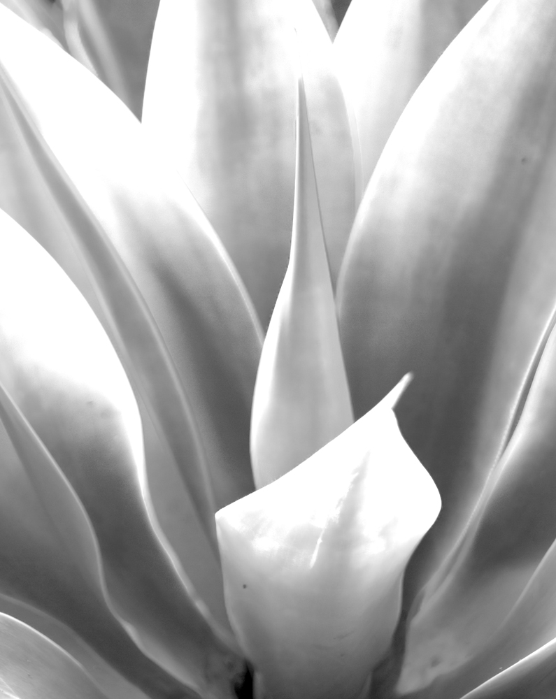
Flowing Intersections Posted bynightcyclingJanuary 9, 2015January 10, 2015Posted inUncategorizedTags:monochrome, photography, succulent Share this: Share on X (Opens in new window) X Share on Facebook (Opens in new window) Facebook Like Loading... Related
I need to give monochrome a try. Do you take a colour pic and edit it it to black and white or do you set it up in camera? Reply
Colour first, and then black and white. I expected to leave this one in colour, but it looked more striking in black and white. Other photos can look quite bad in colour, but if I play around in B & W, suddenly I have a great photo. Reply

I need to give monochrome a try. Do you take a colour pic and edit it it to black and white or do you set it up in camera?
Colour first, and then black and white. I expected to leave this one in colour, but it looked more striking in black and white. Other photos can look quite bad in colour, but if I play around in B & W, suddenly I have a great photo.