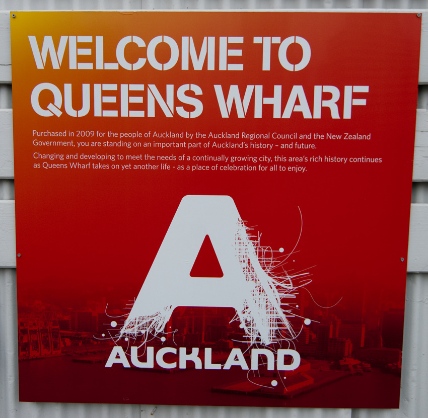
Or is there something slightly disturbing about the fact that the logo for Auckland appears to be of an A falling apart and unravelling. Auckland City Council has a history of approvong some pretty bad logo designs.
Or is there something slightly disturbing about the fact that the logo for Auckland appears to be of an A falling apart and unravelling. Auckland City Council has a history of approvong some pretty bad logo designs.


One-off public cycling on the soon-to-be-opened southbound lane of the Newmarket Viaduct, Auckland, Sunday 29 August 2010. Heavy showers were interspersed with beautiful sunny periods.


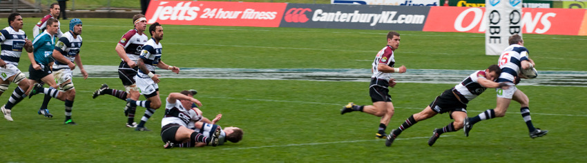
I love watching rugby, especially provincial rugby. The team I support is North Harbour. Here, they are playing Auckland. Auckland play in the blue and white hooped jerseys, Harbour in black, white and maroon.
Not long into the game, Harbour were 14-0 up and there was hope of a large victory. Final score 14-36 to Auckland. Sigh. It is always tough being a Harbour supporter.
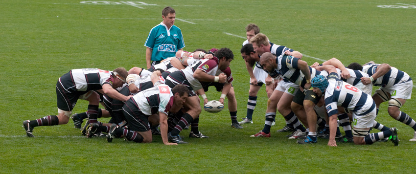
I do love the fact that the refs in this competition are sponsored by OPSM, a company that sells glasses, spectacles and contact lenses… Brilliant.